Three standalone previews · operational documents
Different evidence.
Different reading paths.
Current and proposed versions use the same frozen sample. Open any viewport below; phone comparisons are open by default. Screens scroll within their reading windows, with original-size images and standalone HTML one click away.
Current / proposed
Metrics dashboard
The Performance Sheet
A broad twelve-week trend sits beside a compact mono-figure ledger; change commentary is directly below, before the full channel and service evidence.
Trade-off: The full-width channel ledger and explicit mobile field labels make the document longer. Reliability detail follows the channel table.
Phone · 390 px source captures
Equal-width overview; images are never stretched. Scroll each image window to see the whole document. For full-size type, use the original-size reading window or open the PNG.
Current
390 px · frozen source
Read at original 390 px width
Keyboard: focus the image region, then use arrow keys to pan. The image remains at its captured size.
Proposed
390 px · The Performance Sheet
Read at original 390 px width
Keyboard: focus the image region, then use arrow keys to pan. The image remains at its captured size.
Desktop · 1440 px source captures
Equal-width overview; images are never stretched. Scroll each image window to see the whole document. For full-size type, use the original-size reading window or open the PNG.
Current
1440 px · frozen source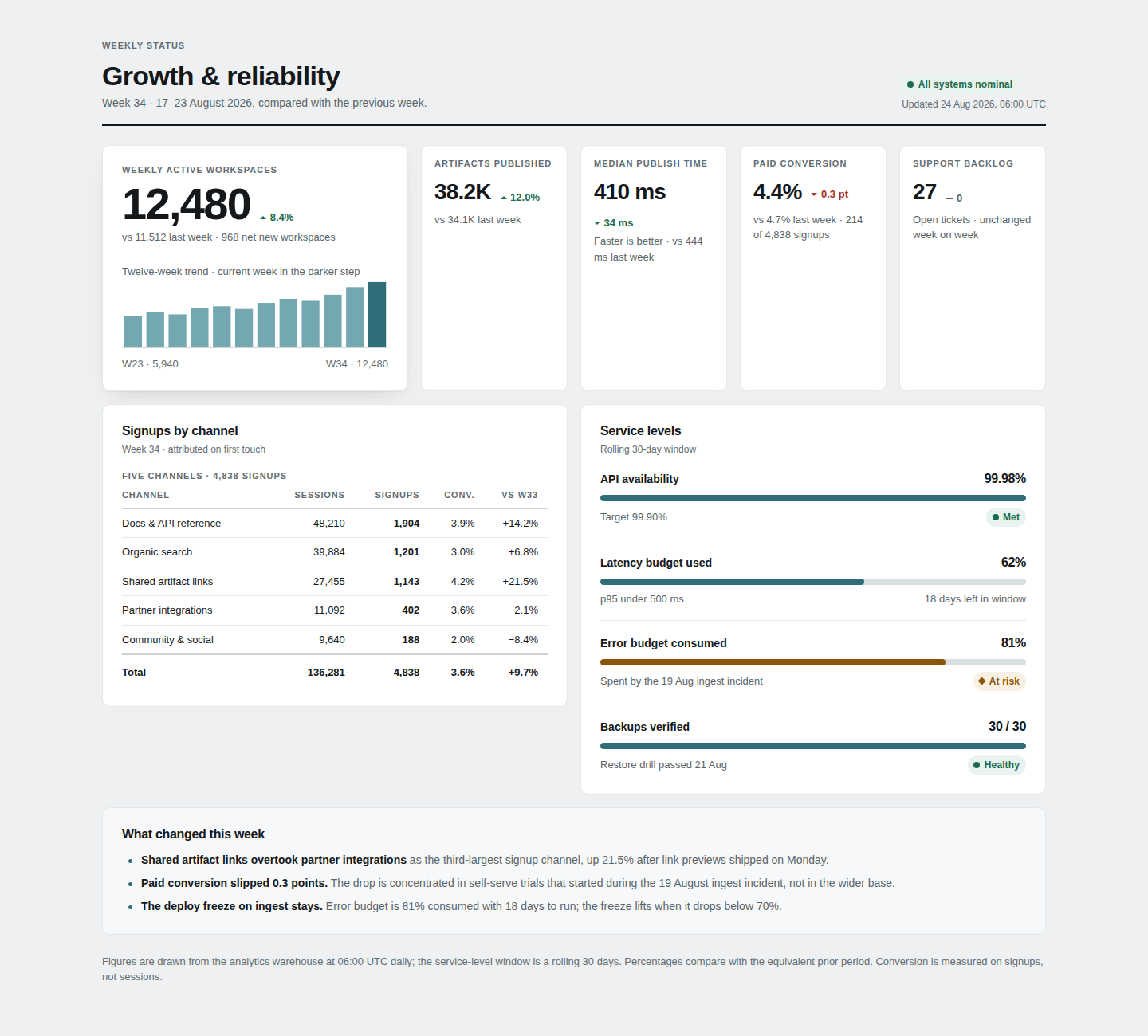
Read at original 1440 px width
Keyboard: focus the image region, then use arrow keys to pan. The image remains at its captured size.
Proposed
1440 px · The Performance Sheet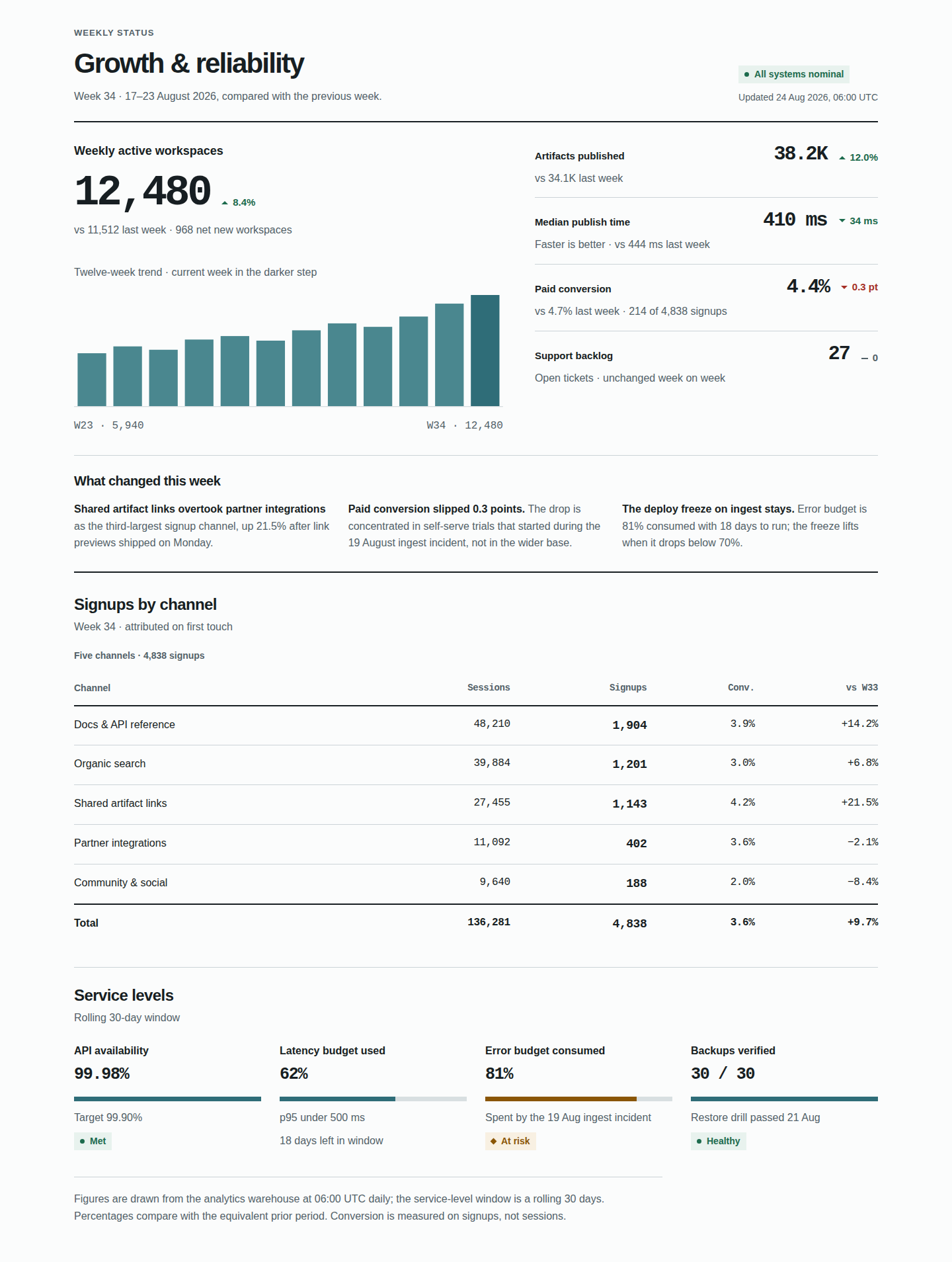
Read at original 1440 px width
Keyboard: focus the image region, then use arrow keys to pan. The image remains at its captured size.
Tablet / sidepanel · 768 px source captures
Equal-width overview; images are never stretched. Scroll each image window to see the whole document. For full-size type, use the original-size reading window or open the PNG.
Current
768 px · frozen source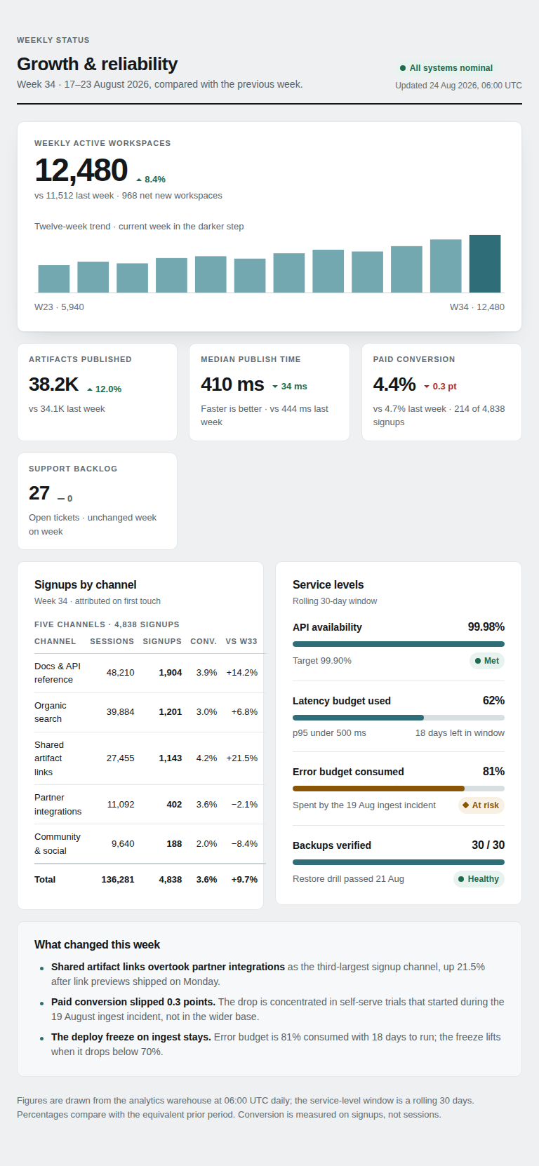
Read at original 768 px width
Keyboard: focus the image region, then use arrow keys to pan. The image remains at its captured size.
Proposed
768 px · The Performance Sheet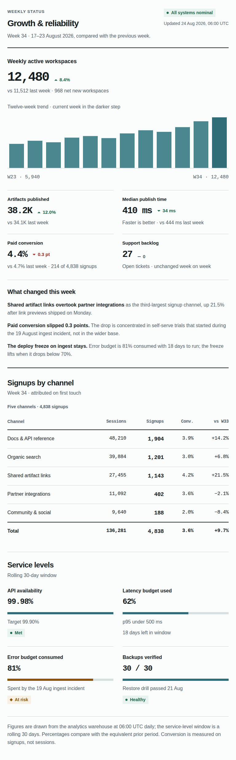
Read at original 768 px width
Keyboard: focus the image region, then use arrow keys to pan. The image remains at its captured size.
Small phone · 320 px source captures
Equal-width overview; images are never stretched. Scroll each image window to see the whole document. For full-size type, use the original-size reading window or open the PNG.
Current
320 px · frozen source
Read at original 320 px width
Keyboard: focus the image region, then use arrow keys to pan. The image remains at its captured size.
Proposed
320 px · The Performance Sheet
Read at original 320 px width
Keyboard: focus the image region, then use arrow keys to pan. The image remains at its captured size.
Why this changed, source parity and verification
The current five-tile skyline gives small companion metrics large empty containers, while the trend and explanation compete with card chrome.
Desktop reads as a performance sheet rather than a row of empty dashboard tiles. The 768px view makes the full trend broad without compressing companion figures. At 390/320, a single metric row keeps value, delta and comparison together; explicit table labels cost height but remove ambiguity.
No new visible DOM text. At mobile, Sessions / Signups / Conv. / vs W33 are repeated once per row, six rows (24 CSS labels). All five original semantic table headers remain available to assistive technology.
Source: d60cb7832ae9eb5616bb1e5f01d6290346e76a49a336e792fa1c5cd1e07e7d8c
Proposed: 696deb41eba35235f401244d909a1505f3b5424a35e578ade883a55c6fcc1730
Separately labelled synthetic fixtures, not the fair sample:
Current / proposed
Project status
The Decision Dispatch
The changed verdict and both fully owned human decisions share the opening; the seven milestones, scope and blocker evidence remain intact below.
Trade-off: Phone readers reach general progress after the two complete asks. The more comfortable prose and explicit ownership also increase phone scrolling.
Phone · 390 px source captures
Equal-width overview; images are never stretched. Scroll each image window to see the whole document. For full-size type, use the original-size reading window or open the PNG.
Current
390 px · frozen source
Read at original 390 px width
Keyboard: focus the image region, then use arrow keys to pan. The image remains at its captured size.
Proposed
390 px · The Decision Dispatch
Read at original 390 px width
Keyboard: focus the image region, then use arrow keys to pan. The image remains at its captured size.
Desktop · 1440 px source captures
Equal-width overview; images are never stretched. Scroll each image window to see the whole document. For full-size type, use the original-size reading window or open the PNG.
Current
1440 px · frozen source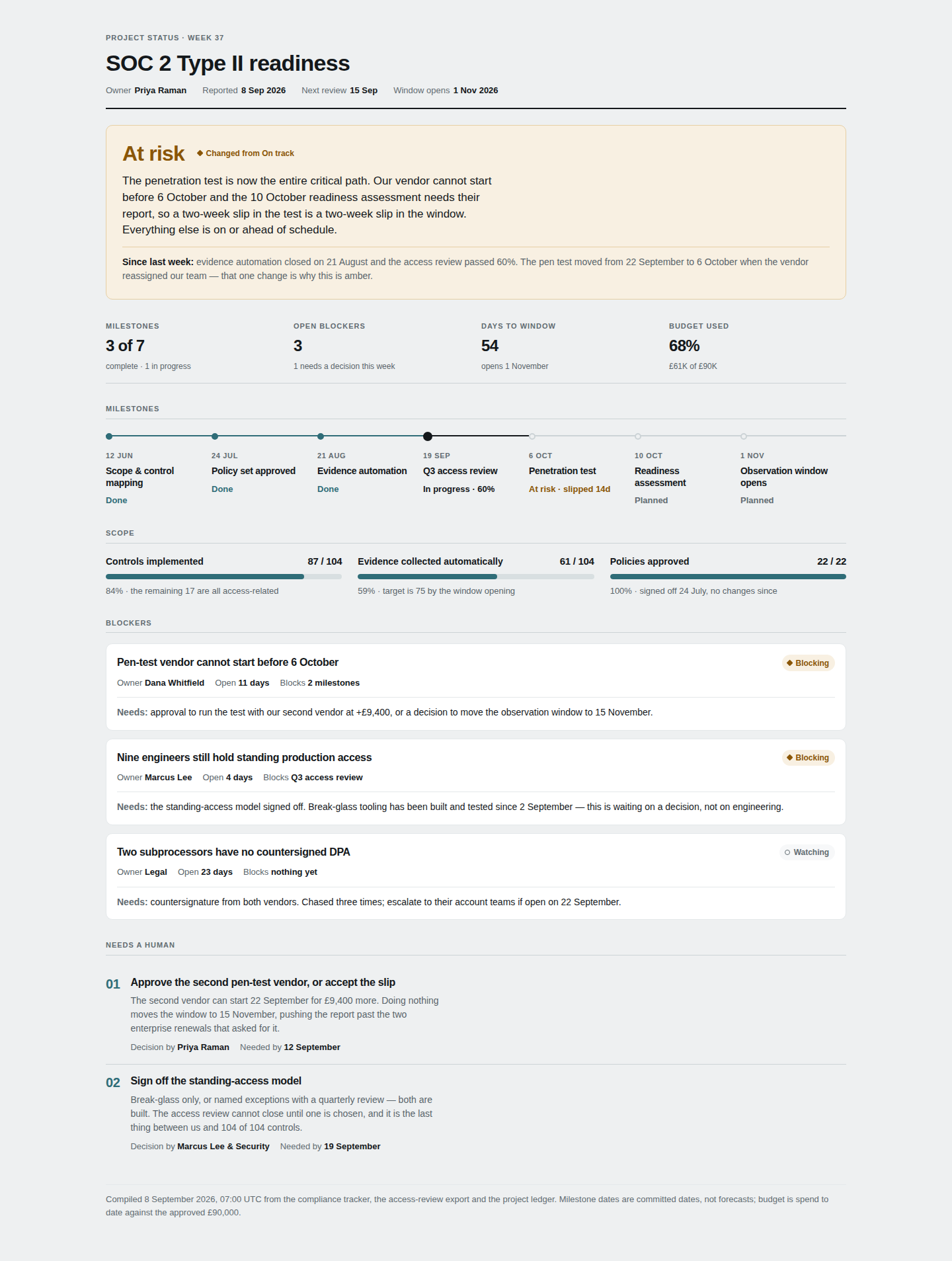
Read at original 1440 px width
Keyboard: focus the image region, then use arrow keys to pan. The image remains at its captured size.
Proposed
1440 px · The Decision Dispatch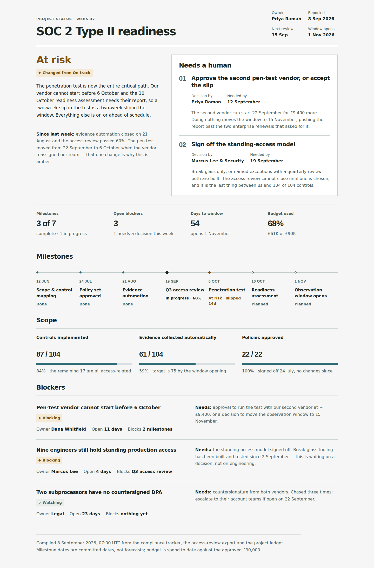
Read at original 1440 px width
Keyboard: focus the image region, then use arrow keys to pan. The image remains at its captured size.
Tablet / sidepanel · 768 px source captures
Equal-width overview; images are never stretched. Scroll each image window to see the whole document. For full-size type, use the original-size reading window or open the PNG.
Current
768 px · frozen source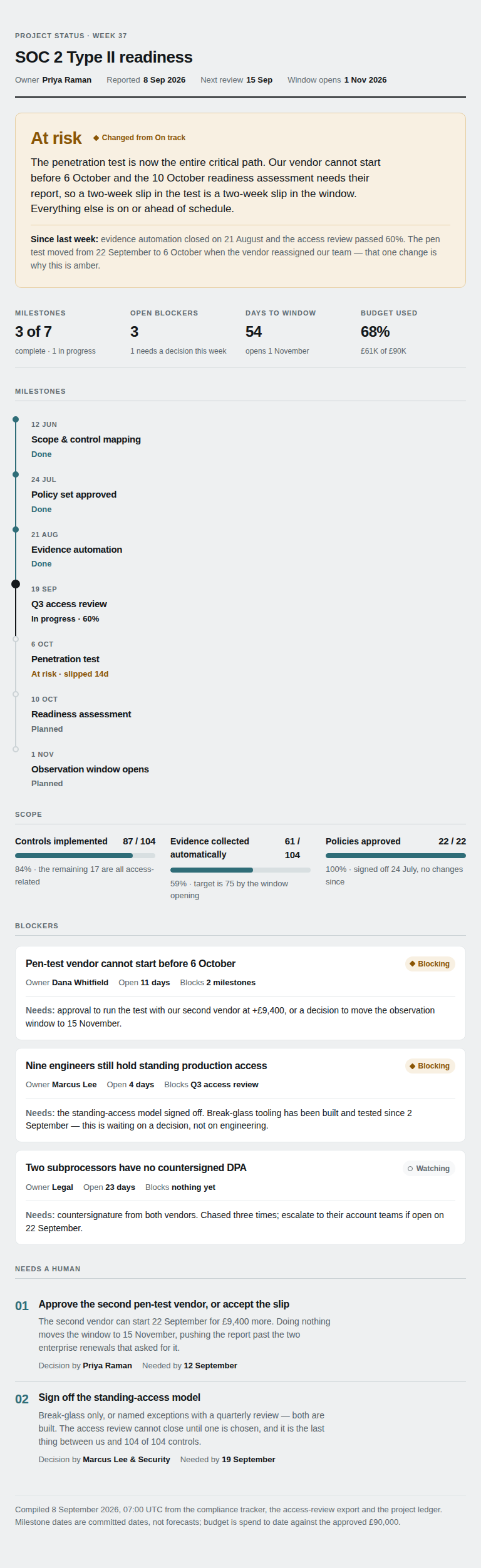
Read at original 768 px width
Keyboard: focus the image region, then use arrow keys to pan. The image remains at its captured size.
Proposed
768 px · The Decision Dispatch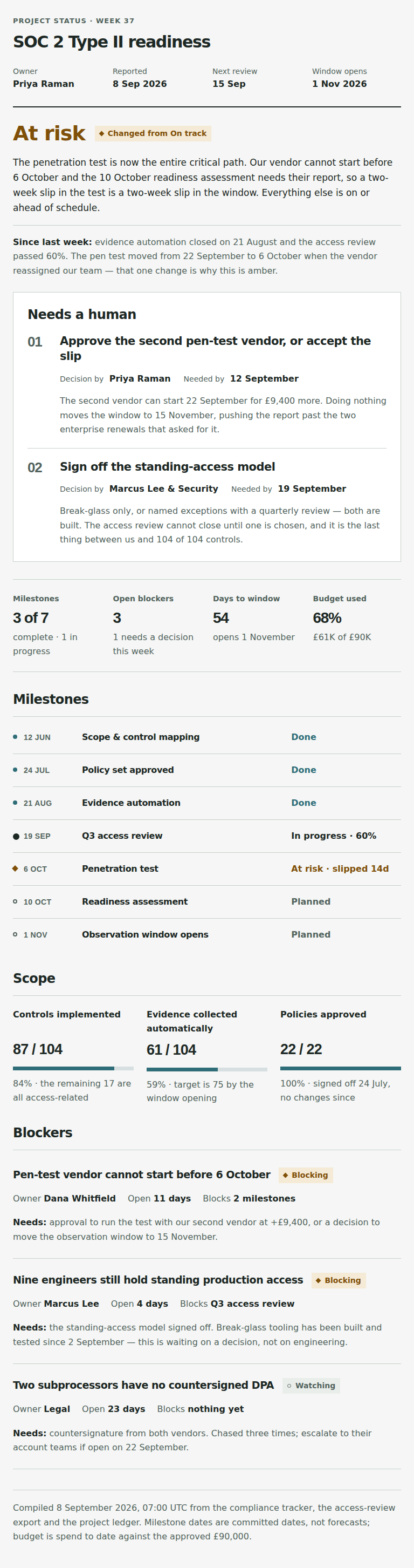
Read at original 768 px width
Keyboard: focus the image region, then use arrow keys to pan. The image remains at its captured size.
Small phone · 320 px source captures
Equal-width overview; images are never stretched. Scroll each image window to see the whole document. For full-size type, use the original-size reading window or open the PNG.
Current
320 px · frozen source
Read at original 320 px width
Keyboard: focus the image region, then use arrow keys to pan. The image remains at its captured size.
Proposed
320 px · The Decision Dispatch
Read at original 320 px width
Keyboard: focus the image region, then use arrow keys to pan. The image remains at its captured size.
Why this changed, source parity and verification
The current sponsor decisions appear only after the milestone, scope and blocker accounting.
The desktop opening is visibly a sponsor dispatch, not a numeric dashboard. Both decision owners and needed-by dates are readily scannable. Mobile gives the verdict, then the complete asks, then the dated milestone evidence. Neutral geometry carries structure; amber marks only actual state.
No new visible DOM text or generated text labels. All ordinals, state words, markers and headings reuse the source. No new links or implied dependency edges.
Source: fcaeb9ee85b88ea4d98d92b553efd23e8a1dd792bf36c8b5a48b5ab8ac71c6a1
Proposed: d8f0db0a085f20cf58bcdff20c04b1525e4e41f19fb17218cbfd7d41c16f484f
Separately labelled synthetic fixtures, not the fair sample:
Current / proposed
Postmortem
The Incident Atlas
A compact engineering identity opens into impact accounting beside the original failure trace, then a time-indexed incident record with a complete root-cause panel.
Trade-off: Less literary than the current design. Full-width phone events and comfortable action records make the incident review longer.
Phone · 390 px source captures
Equal-width overview; images are never stretched. Scroll each image window to see the whole document. For full-size type, use the original-size reading window or open the PNG.
Current
390 px · frozen source
Read at original 390 px width
Keyboard: focus the image region, then use arrow keys to pan. The image remains at its captured size.
Proposed
390 px · The Incident Atlas
Read at original 390 px width
Keyboard: focus the image region, then use arrow keys to pan. The image remains at its captured size.
Desktop · 1440 px source captures
Equal-width overview; images are never stretched. Scroll each image window to see the whole document. For full-size type, use the original-size reading window or open the PNG.
Current
1440 px · frozen source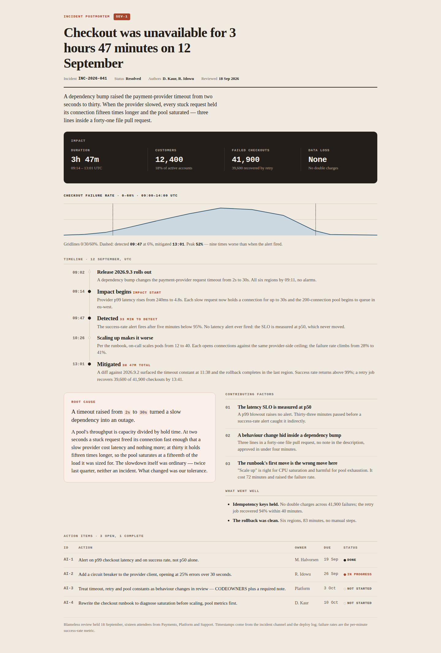
Read at original 1440 px width
Keyboard: focus the image region, then use arrow keys to pan. The image remains at its captured size.
Proposed
1440 px · The Incident Atlas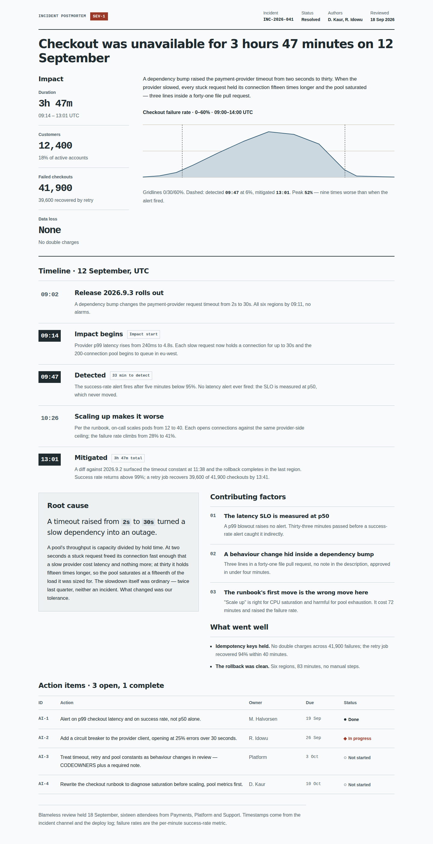
Read at original 1440 px width
Keyboard: focus the image region, then use arrow keys to pan. The image remains at its captured size.
Tablet / sidepanel · 768 px source captures
Equal-width overview; images are never stretched. Scroll each image window to see the whole document. For full-size type, use the original-size reading window or open the PNG.
Current
768 px · frozen source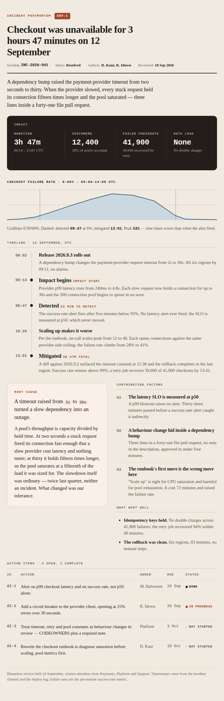
Read at original 768 px width
Keyboard: focus the image region, then use arrow keys to pan. The image remains at its captured size.
Proposed
768 px · The Incident Atlas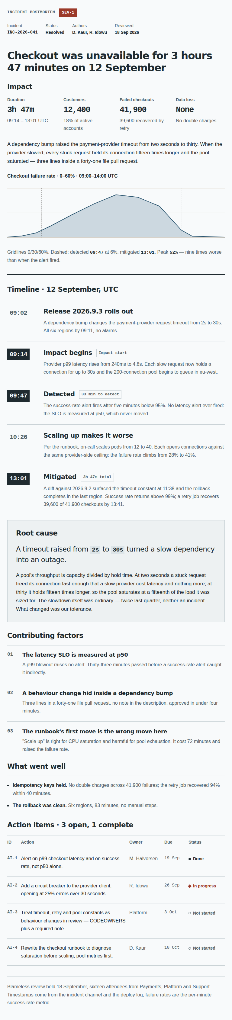
Read at original 768 px width
Keyboard: focus the image region, then use arrow keys to pan. The image remains at its captured size.
Small phone · 320 px source captures
Equal-width overview; images are never stretched. Scroll each image window to see the whole document. For full-size type, use the original-size reading window or open the PNG.
Current
320 px · frozen source
Read at original 320 px width
Keyboard: focus the image region, then use arrow keys to pan. The image remains at its captured size.
Proposed
320 px · The Incident Atlas
Read at original 320 px width
Keyboard: focus the image region, then use arrow keys to pan. The image remains at its captured size.
Why this changed, source parity and verification
The warm serif narrative and dark impact strip are coherent, but visually overlap the research family; the narrow phone timestamp gutter makes long events harder to read.
The evidence spread has an engineering identity distinct from the approved serif Report. The complete curve and dashed annotations remain legible. At phone width, the time plate and event prose use separate full-width rows; the action table becomes an accountable record list.
No new visible DOM text. At mobile, Owner and Due repeat for each of four actions (8 painted CSS labels). Other data-mobile-label attributes are defined but not painted. Original table headers and SVG accessible name remain intact.
Source: 336ec7b129f1ade44e1b36c505f1efec847737651cbf6496cf29f3258ea665c2
Proposed: 791e91c086761ac21825ceca2ccb13d86699209e9533ec91e179b96dd38815a9
Separately labelled synthetic fixtures, not the fair sample: